Website Creator 12 Released by Summitsoft

Finally Anyone Can Easily Create Fully Responsive Websites


OMAHA, NE – February 10, 2017 – Summitsoft Corporation announced today the release of Website Creator 12, the first website designing software that incorporates fully automated Responsive Website components. Now visitors to your website will always see your web pages at their best, whether they navigate on a desktop, tablet or smart phone. It is estimated that over 65% of all web traffic is now coming from mobile devices like smartphones and tablets. Make sure your site is ready to shine on those devices.

You don’t need any programming skills to create a gorgeous website, with the intuitive visual interface and Drag & Drop simplicity. Make the most of all the advanced features that Website Creator 12 offers to create eye-caching sites.


A few of the many features in Website Creator 12 include:


Graphic Templates
Over 1000 ready to use graphic templates to chose from with many of them being full screen background images.

Get Social
Add Facebook, Twitter or LinkedIn to grow your online presence. Connect your social accounts to your blog and get popular on the web.

SEO and Analytics
Website Creator 12 generates the HTML5 code and CSS3 to get your site indexed quickly. So you’ll be easy to find on Google, Bing and other search engines.

Pictures, Videos and Galleries
Add captivating content: chose animated galleries, panoramic photos, videos, music and more.

Sell Your Product Online
Complete Shopping Cart functions with credit card payment facilities.

Powered by Website X5
Millions of people have chosen the Website X5 engine to create successful websites worldwide.

One Year Free Website Hosting
Website hosting provided by One.com, a global leader in website hosting with 24/7 chat support.

About Summitsoft

Summitsoft Corporation is a publisher of productivity software products, creating innovative business solutions for professionals and home users. Summitsoft offers software through major retailers in North America, South America, Australia, the United Kingdom, South Africa and Europe, as well as on the Internet.


Press Contact:
Lynn M. Rudolph
Media Relations
Summitsoft Corporation
lrudolph@summitsoft.com

Adding Expansion Packs to Logo Design Studio Pro

Adding expansion packs to our best selling logo creation software, Logo Design Studio Pro has never been easier. Below is a step by step video and content guide to walk you through the process. In this video we’ll be instructing you on installing the Cutting Edge Pro Expansion Pack.     Step 1. Purchase and install one of the Expansion or Premium Content Packs designed specifically for Logo Design Studio Pro Step 2. Open Logo Design Studio Pro and click the blue button labeled “Click Here to Update Logo Content”. The program will automatically find and detect the expansion pack installed on your computer. Step 3. The name of your expansion pack will be added to the list on the left and the logos will be displayed on the right. Step 4. Enjoy the new content and start creating something wonderful.

Summitsoft Releases Business Card Studio 10 and Creative Fonts 3D

Summitsoft Releases BUSINESS CARD STUDIO PRO 10 and CREATIVE FONTS 3D OMAHA, NE – April 30, 2016 – Summitsoft Corporation, a leading developer and publisher of Windows productivity software, announced today the launch of Business Card Studio Pro 10 and Creative Fonts 3D.  Both products are major updates to existing products and offer many new and unique features. •    Business Card Studio Pro 10 – combines the revolutionary ACG (advanced concept generator) and 3D Text Studio, giving you design options never before available in any business card software.  After you input your name, title, business name and other data, ACG generates an unlimited number of business card design variations. Then you are able to alter the various card designs, including 3D effects, for a unique look.  When you’re done, Business Card Studio Pro 10 assists you in designing professional looking letterhead and envelopes, creating a consistent look on all your printed material.  Now you finally have all the tools that professional designers use. •    Creative Fonts 3D – 3000 OpenType® Fonts and 2000 Alphabet Art Fonts all created by hand at the SummitType™ Foundry, and fully licensed for commercial use.  Included in Creative Fonts 3D is 3D Text Studio, which allows you to make any font 3 dimensional for maximum impact. About Summitsoft Summitsoft Corporation is a publisher of productivity software products, creating innovative business solutions for professionals and home users. Summitsoft offers software through major retailers in North America, South America, Australia, the United Kingdom, South Africa and Europe, as well as on the Internet. For additional information please visit our website at www.summitsoft.com Press Contact: Lynn M. Rudolph Media Relations Summitsoft Corporation lrudolph@summitsoft.com

Summitsoft Releases PhotoTools 2

Summitsoft Releases PhotoTools 2 OMAHA, NE – January 25, 2016 – Summitsoft Corporation, a leading developer and publisher of Windows productivity software, announced today the upcoming release of PhotoTools 2, which will replace the Company’s older product, Photo Tool Kit. PhotoTools 2 was developed to utilize the newest Windows® operating system and has everything you need for advanced editing, enhancing and effects. Your photos will come to life with vibrant color and deep highlights that are sure to impress. PhotoTools 2 is packed with filters and effects that take your photos to the next level and make it easy to enhance or fix any photo. If you want to restore an old photo or make a new photo look like it was taken on a vintage instamatic camera, PhotoTools 2 has what you need. • Photo Editing Tools o Crop, Color Adjust, Re-Size, Black&White and Layered Images • Photo Enhancement Tools o Auto Enhance, Color Correction, Retouch Tools, Heal & Clone Brush, Fix Perspectives and Photo Alignment • Photo Effects Tools o Text, Color and Lens Effects, Distortion, Textures and Borders • Panorama and Collage No matter if you take photos with an expensive DLR camera or your smart phone, PhotoTools 2 will help take your pictures to a new level that will impress your friends and family. About Summitsoft Summitsoft Corporation is a publisher of productivity software products, creating innovative business solutions for professionals and home users. Summitsoft offers software through major retailers in North America, South America, Australia, the United Kingdom, South Africa and Europe, as well as on the Internet. Press Contact: Lynn M. Rudolph Media Relations Summitsoft Corporation lrudolph@summitsoft.com

Summitsoft Releases WEBSITE CREATOR 10

FOR IMMEDIATE RELEASE Summitsoft Corporation Summitsoft Releases WEBSITE CREATOR 10 OMAHA, NE – January 13, 2016 – Summitsoft Corporation, a leading developer and publisher of Windows productivity software, announces the next generation in website design with the launch of Website Creator 10. You don’t need any programming skills to create a website with Website Creator 10, all you need is a mouse! You work with a fully visual intuitive interface, with plenty of previews of your work that are constantly updated in real time. Website Creator 10 has all the features you need to create attractive and professional websites.
  • Responsive Web Design (RWD)

Website Creator 10 is the first website design software to utilize Responsive Web Design technology. When you create your website with RWD, it doesn’t matter if your website is viewed on a desktop, tablet or smartphone the pages will be automatically adapted to the size of the device being used so that content and pictures are clearly visible and visitors have a perfect navigating experience, always!

  • Optimized Websites

Being among the first in the rankings of search engines such as Google, Yahoo! and Bing is fundamental for your site’s visibility and increasing the number of visitors. You provide the content and Website Creator 10 will do all the rest, generating code according to industry standards. You don’t have to be a programmer, Website Creator 10 prompts you for the necessary information, such as titles, key words and alternative text, to best optimize each page.

AN ALL-IN-ONE SOLUTION Save time and effort, because Website Creator 10 includes everything you need to create eye-catching and fully comprehensive websites. There’s a specific tool for every job, from editing images and photos, to creating buttons, to automatically generating menus, right up to going online with the built-in FTP engine. You don’t need any other software – Website Creator 10 has it all. You are free to sign up with any web provider you prefer, but it’s worth remembering that Website Creator 10 includes registration of your own domain name, 30 GB of web space and one (1) full year of free website hosting. About Summitsoft Summitsoft Corporation is a publisher of productivity software products, creating innovative business solutions for professionals and home users. Summitsoft offers software through major retailers in North America, South America, Australia, the United Kingdom, South Africa and Europe, as well as on the Internet.

Creating A Logo For Your Landscape Company

Landscape logo

Creating a logo for your landscape company is one of the most important things you can do to build a lasting brand and grow your business.  Whether you’re just starting out, or you have a landscape company that has been around for decades, your logo is a critical part of your company’s identity and it’s important that it showcases your business in the best possible way.  After all, a good logo has the power to attract and retain new customers while an ugly logo can easily turn people off.

In the garden and landscape business, you’re selling a service.  Homeowners and local businesses hire you to help improve the curb appeal of their homes and establishments.  So your logo needs to not only represent your company, but keep in mind that your landscape company logo will also reflect the qualities of the people who hire you and choose to work with you.  To that end, you need to have a good understanding of your target market before you start the design process.  Are you going to be an accessible and affordable option for homeowners who need some help or are you going to cater to a high-end clientele.  How you answer that question will directly impact the design of your company logo.

Logo Color Ideas For Your Landscape Company

Color Choices

On the surface, when you first think about logo colors for a landscape company, your first thought is probably, “Ok, let’s make it green!”  And the thing is that green really does work very well for this industry.  Not only does it tie in perfectly with the idea of nature and lawncare, but it also evokes a feeling of growth and health.  That being said, there are a lot of other colors in the color spectrum, so here are some other ideas for great colors in a landscape logo to get you going:

  •   Green is the go-to color for landscape company logos. When in doubt, green will almost always work.
  •  Try incorporating multiple shades of green to add depth.
  •  Don’t shy away from bright sunny colors like orange and yellow – they’ll help give your logo an upbeat, accessible feel
  • For a high-end, streamlined look plain black and white works great even for landscape companies
  •  Use several shades of the same color, which gives a rich, lustrous appearance
  •  Try pairing various shades of green with brown or a deep red for a rich, natural feel
  •  Using blue to help accent your company name or different parts of your logo will help evoke the feel of a strong, loyal landscape company

Logo Image Ideas for Your Landscape Company

Landscape Logo Graphics

One of the great things about creating a logo for a landscape company is that you have an almost endless supply of images that all work extremely well.  There are so many images that tie directly to your industry that the hardest part will probably be honing in on just the right image.  Also, keep in mind that logo images carry a lot of brand personality so even if you choose a tree to represent your company, make sure the design of that tree reflects your landscape company. 

  • Let nature be your guide.  Trees, leaves, grass and flowers all make wonderful logo images
  • If you focus on residential landscaping, help drive that point across by including a home with trees or a yard in your logo
  • Don’t be afraid to go with an abstract design if your landscape company is a little more youthful and modern.  A simple circle or swoosh can work very well for the right company.
  • Most landscape companies are local and showcase your local pride by pulling in a local monument, your state outline or anything else that helps tie your homebase to your logo
  • For an understated look, you can always go with a simple monogram or your company name.  This works particularly well for more traditional and high-end landscape logos.

Font Ideas for Landscape Logos

Out of everything, the font you choose for your logo will convey the personality of your landscape company more than almost anything.  There is no right or wrong way to choose a font either – it’s something that you will likely have to play around with until you find the right fit.  That being said, there are definitely some font types that work better than others for landscape logos.  Here are a few tips and ideas:

  • The majority of landscape companies will want to be perceived as hard-working and stable.  A strong serif font similar to Times New Roman can help get that feeling across
  • Stay away from casual handwriting fonts – they will make it more difficult for people to take your lawn and landscape services seriously
  • Incorporating a sans-serif font similar to Arial into your landscape logo can help give your brand a high-energy, efficient feel
  • A formal script font can work for landscape companies who focus on very high-end clientele, but will be far too formal and exclusive-looking for most companies

Creating a captivating and effective landscape logo can take some time and require some creative things. Thankfully, there is cost effective logo creation software where you can simply create you logo using one of the thousands of logo templates, select your color scheme, add your business name, and start doing business the next day. Sure, we’d all like to spend hundreds, even thousands of dollars having someone else create our logo but the truth is, starting a business means saving a few buck in the beginning so why not start with a cost effective logo creation tool where you can have your business up and running in a day?

Summitsoft Introduces Powerful & Affordable Graphic Design Software

Create beautiful graphic designs and vector illustrations with Graphic Design Studio

Graphic Design Software

Summitsoft Corporation has recently released its illustration and design software titled “Graphic Design Studio”, bolstering its industry-leading productivity software portfolio. This powerful graphic design software offers tools for all experience levels and includes 2,000+ pre-designed vector graphics and royalty free images.

The software’s vector-based objects allow for infinite scalability since, unlike raster images, does not require individual pieces of information to create a full image. This allows users to scale the image up or down as much as much as they desire without losing any image quality. In addition, the vector-based objects allow for efficient edibility since users can modify individual elements of their images without affecting other objects in or around each image.

Graphic Design Studio, along with its detailed help guide and drag and drop technology, makes Summitsoft’s latest offering one of the most user-friendly and affordable graphic design titles on the market. Here are a few other highlights of the highly-anticipated illustration software:

  • Flexible tools including full layer support, powerful Bezier editing tools and support for SVG files
  • 65+ commercial use fonts
  • Over 100 Professionally-created design Ideas including posters, postcards, web banners, and more
  • A flexible, open canvas to create graphics in any size and any amount of detail

Graphic Design Studio starts at a retail price of $49.99 and is compatible with Windows® XP, Windows® Vista, Windows® 7, Windows® 8, Windows 10 operating systems on PCs with a with Pentium 400 MHz or higher processor. To learn more about the newly-released software, visit Summitsoft.com.

About Summitsoft Corporation

Summitsoft Corporation is a top-ten publisher of productivity software products, creating innovative business solutions for professionals and home users. Summitsoft offers software through major retailers in North America, South America, Australia, the United Kingdom, South Africa and Europe, as well as on the Internet. For additional information please visit our website at www.summitsoft.com.

Business Cards 101

Business cards can help you create a positive first impression and having a well thought out and high-quality card let’s others know just how much you care about your business and their relationship. Here are a few tips in creating the perfect business card for you and your business. businesscardstudioinfographic 
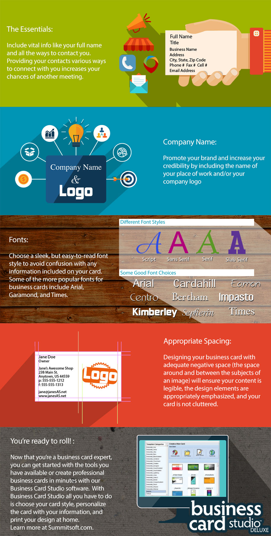
Learn more about our Business Card Studio by visiting the product page here or subscribe to our mailing list to receive updates on all our productivity software and exclusive offers!

Why Now Is The Best Time to Start Your Business

In the spirit of National Entrepreneurship Month, here is why now is the best time to start your business. If you didn’t know, November has been set aside as the month in which we celebrate those who have the guts, drive and determination to venture out and start their own business. This month we’ll also celebrate Global Entrepreneurship Week (November 17-23), National Entrepreneur’s Day (November 18th), Global Women’s Entrepreneurship Day (November 19th) and Small Business Saturday (November 29th).

With all the focus on entrepreneurship and small businesses, it might be the perfect time for you to start thinking about making your dreams of business ownership a reality. Now really is the perfect time to start your business and here’s why:

Low Barriers For Entry

Never in the history of our country has it been easier to start a business. For many businesses, the startup investment needed has dropped substantially and the U.S. Government has realized that small businesses and entrepreneurs are the engine that really drives our economy. This means that both money and assistance for new businesses are easier to find than they were years ago.

You’ve just got to make sure you set realistic expectations for your new business. Starting small and growing your business organically will take less startup capital, but will probably be slower to grow. If you have big billion-dollar business dreams, you’re going to need a lot more funding, but the potential reward will likely come sooner. It all depends on the amount of risk you’re willing to take on.

The Tools For Success Are Fantastic

If you haven’t noticed, there are some pretty fantastic business tools available these days, which are either incredibly inexpensive or completely free. You can now download and have access to everything from accounting software to website development tools to email programs on a shoestring budget. 10 or 15 years ago, just those three items alone would cost tens of thousands of dollars, but today, most budding entrepreneurs can easily afford these tools for a very small price.

The advent of smartphones and social media sites has also made finding new customers and marketing to them so much more affordable. For a local business, running a targeted ad through Facebook is a much better use of marketing dollars than placing a traditional ad in a newspaper or on the radio. Put simply, the tools available to entrepreneurs today make starting and running a business more straightforward, more affordable and more fun.

Entrepreneurs Come In All Shapes And Sizes

While the image of a moneyed, techy, white male in Silicon Valley might inadvertently pop into your head when you hear the word ‘entrepreneur’, that visual only represents a very small slice of the people who actually start businesses each year. In the U.S., entrepreneurs come from every race, age bracket, weight class and income level and are almost as likely to be female as they are male. There are no rules about who can apply to become an entrepreneur – a great business idea and a great drive to succeed are all that is required.

That’s the beauty about starting your own business – anyone can do it. There are no prerequisites and your unique entrepreneurship story is one that people will want to hear. So if you’ve been second-guessing yourself and telling yourself that you don’t “fit the mold” of what an entrepreneur looks like, it’s time for you to get some new glasses, because there is no mold for entrepreneurs.

Time Is Of  The Essence

It may be tough to hear this, but that great business idea that you’ve been sitting on for years? Someone else has probably thought of the same idea and is working to turn that idea into a business right now. Time is of the essence and the longer you wait, the more likely it is that someone else is going to come along and turn your business idea into their reality.

What are you waiting for? Don’t miss your chance to do what you’ve always dreamed about. Start taking action today to make your business dreams a reality. Even just one little step each day is a little step forward and moves you closer to your goal.

There Is No Better Time Than The Present

There will never be a perfect time to start a business. The economy will be bad or you’ll have a family emergency or there will always be some other reason not to get your business off the ground. There will always be excuses not to start your business, so you might as well bite the bullet and become an entrepreneur today.

If you’re ready to take the plunge and start a business, there are thousands of places to get the help you need. Here are just a few of the official websites new entrepreneurs should take a look at:

Small Business Administration – sba.gov
Chamber of Commerce – uschamber.com
S. Copyright Office – www.copyright.gov
S. Department of Labor: Office of Small Business Programs: www.dol.gov/osbp
S. Patent and Trademark Office: www.uspto.gov

How to Write Copy that Sells

“The customer isn’t a moron; she is your wife. You insult her intelligence if you assume that a mere slogan and a few vapid adjectives will persuade her to buy anything.” – David Ogilvy The art of writing good copy is one that few do well. It’s a challenge to write content that is not only engaging, but that boosts sales as well. The good news is that with a little hard work and focus, you can create stellar content for your business that will boost sales. Here are a few tips to get you started:

Focus on one simple goal

To write really effective copy, you’ve got to focus your efforts. What action is it that you want your reader to take? Do you want them to sign up for your email list?   Do you want them to download a free trial? Do you want them to make a purchase?   Focusing your copywriting efforts on achieving that one goal will help add clarity to your efforts. The structure, language and action items can all be tailored to your purpose when you focus on one goal, which means that the chances of success will also increase.

Don’t bury the lead

Customers aren’t going to wait around for you to tell them why they should buy – you need to lead with the good stuff. Hook them from the beginning with the best things about your product and then once you’ve got them hooked, you can get into all the details. Don’t talk down to your customers No one likes the feeling of being patronized, and taking a “we know best” tone is insulting to customers and will turn them off in a heartbeat. Assume that your customer has the intelligence to understand what you’re selling. And if you are selling a product that actually is complex and a bit difficult to grasp, there are ways to educate people through your content without treating them like they are children.

Know who your target customer is

It’s so important when you are writing sales content, that you know who you are writing for. The tone, language and structure you use could vary widely based on who you’re writing for. For example, if you have a product aimed at the teen girl market, the language, graphics and content you present will be dramatically different than if you’re trying to sell something to an upper-class middle aged man. Knowing who your customer will make your content better and your sales will show it.

Understand the needs of your customer

Once you know who your target customer is, understanding what it is that your customer actually wants or needs the next step in crafting solid content. When you can identify what the need is, it becomes much easier to create content that speaks to your customers. Similar to setting your primary goal, you’re going to want to focus your efforts here. While it may be tempting to show that your product can address a wide variety of needs, you’re going to be more successful if you can show how your product takes care of the primary need of your customer.

Explain the benefits

This may seem like common-sense advice, but focusing on the benefits of a product rather than the features can be a challenge. It goes back to understanding the needs of your customer. You can run ads, create brochures and design entire websites to explain the benefits of your product, but if you don’t tell the customer how it’s going to improve their life, you’re never going to get the sale. When creating your sales content, keep the customer front and center in your mind and ask yourself, “what will my product do for you?”

Make it a conversation, not a presentation

We all remember those teachers and professors who would stand at the front of the classroom and read straight from the textbook. That type of presentation is incredibly boring and more likely to turn customers off than it is to make a sale. When creating content for sales, try to make it a conversation rather than a presentation. If it helps, bring someone else in the room to talk through the content and take some notes. How you phrase things verbally will likely sound much more relaxed than if you were to try and write it out.

Edit aggressively

Leonardo da Vinci once said, “Simplicity is the ultimate sophistication,” and when it comes to writing good sales content, you should make da Vinci’s phrase you personal motto. The first draft of any piece of content that you write is exactly that – a first draft. Take the time to really comb through your content and remove anything that doesn’t support your main goal or isn’t targeted at your customer. Don’t be shy about editing – the simpler your message, the easier it will be for customers to understand.

Ask for the sale

Growing up in the retail business, one of the first things I learned was that if you do your job, asking for the sale should be the easiest thing in the world. The same thing goes for your content – if you’ve done your job, asking for an email signup or a free trial download or a sale at the end of it should be feel incredibly natural. Use action words to spell out clearly what you want your customer to do and then make it incredibly easy for them to complete the process. Finally, remember that content is important. In this day and age, crafting good content should be at the foundation of any business. Invest time and energy into getting your sales content right and it’ll have a direct impact on your bottom line.

How to Create a Consistent Brand in 3 Easy Steps

If you’ve heard it once, you’ve heard it a million times – the key to great branding is consistency. You’ll see this in virtually every textbook, blog post and eBook about branding and it’s not wrong. Offering up a consistent image for your brand directly correlates to the level of success you’ll be able to achieve. You might think, “Ok, how hard can it be to use the same logo and fonts and colors in my marketing?” And while your logo, font and color choices are all vitally important in maintaining a consistent brand image, your brand is so much more than what it looks like in an advertisement. To offer up a truly consistent brand image and build your business, here are three things you should focus on:

Really understanding your brand position

Your brand position helps explain who you are as a company and who you want to sell to. A good brand position helps establish where you fall in the marketplace and how you are different from your competitors and understanding your brand position will help set the tone for all your marketing and branding. Still not clear on what your brand position is? Take a look at these questions to help clarify:
  • Who are my customers or who do I want my customers to be?
  • What do you want your brand to be known for?
  • What do you do better or different from your competition?
  • How would I describe my brand’s personality?
When you understand what you brand position is, it becomes much easier to focus your marketing efforts.

Establish your brand image

Once you’ve established your brand position, work on cementing an image for your brand. Crafting a brand image is hard work and will definitely include the following:
  • Creating a killer logo
  • Choosing a font or set of fonts to use in all marketing, social media and branding
  • Choosing a color palette to work
You’ll also want to think about the type of imagery you’ll use in your marketing and branding pieces. Are you going to include lifestyle shots with people using your product? Or is a clean, modern look without people a better fit? If your logo features a character or animal, you may even want to think about making that a focal point of your branding. Even if your logo doesn’t feature a character or animal, a type of company mascot that embodies the personality of your company can be an easy way to create a consistent brand image.

Articulate your brand standards and stick to them

Once you establish your brand position and your brand image, don’t be content to let your ideas just float around in your brain. Commit those branding ideas to paper so that you have something tangible to draw from. Better yet, put together a simple brand standard guide, which outlines the following:
  • What your logo looks like
  • Any variations of your logo (alternate colors and layouts)
  • How your logo should be used
  • Any colors that are important for your brand
  • Any fonts that are important for your brand
  • Any brand images, artwork, or mascot
  • Specifics for how your company name should be printed (lowercase vs. uppercase)
If you have a specific perspective on what type of imagery should be used, a description or even examples would be helpful to include. Don’t forget that Rome wasn’t built in a day and neither is a brand. Building a strong, recognizable brand takes creativity, time and a lot of sweat equity. If you put together a brand plan and stick to it, you’ll be making headway before you know it.

Logo Design Prep Checklist

Designing a logo can be a daunting task even with the best tools in the world.  How do you capture the essence of who your company is in one small brand image?  On the surface, designing a logo can seem like an almost insurmountable task, but let us assure you that it doesn’t have to be.  One of the things that will make the logo design process so much easier is if you can do a little prep work ahead of time. To help you get your head around the process of designing a logo, we’ve put together a straightforward and simple checklist.  Before you start the process of designing a logo, do yourself a favor and think through the following questions.  It will help focus your efforts and will probably give you some good ideas too! a1sx2_Checkbox_thumb2_check_box.png
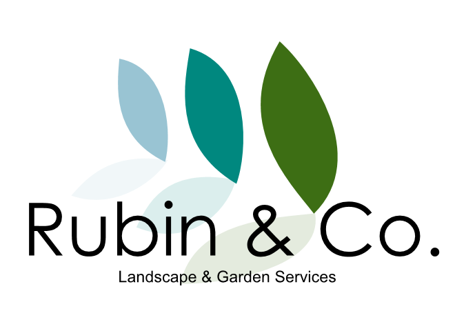
What is the name of your company or product? The vast majority of logos highlight the company name or product and for most small businesses, we would certainly recommend using your company name.  There are cases (like the Boston Red Sox), that a company may choose not to incorporate the name, but for most small businesses, this is a no-brainer. a1sx2_Checkbox_thumb2_check_box.pngIf the logo is for a company, what is your primary product? What you sell can and should influence the design of your logo.  If it makes sense to tie in your industry or primary product in your logo, by all means, do so!  Remember that your logo not only needs to look good to your current customers, but it needs to do the job of attracting new ones as well. a1sx2_Checkbox_thumb2_check_box.pngDo you have a tagline? You wouldn’t necessarily need to include the tagline with the logo, but if you have an established tagline, it can certainly help establish the tone that you want to convey with your logo. a1sx2_Checkbox_thumb2_check_box.pngWhat is your company’s personality? Are you laid back and fun or do you want to be known as extremely professional?  You need to establish the tone that you want to convey with your logo before you design it.  You also need to take into consideration your industry as well.  You may very well run a fun, laid back business, but if you work in a very serious industry, your logo probably needs to be more on the straight-laced side.  Think about where your company would fall on the spectrum of these descriptors:
  • Friendly or Professional
  • High energy or Extremely thorough
  • Modern or Traditional
  • Cutting edge or Established
  • Fun or Serious
  • Accessible or High end
a1sx2_Checkbox_thumb2_check_box.pngWhat makes your company unique? Do you know what makes your company different from everyone else in the marketplace?  Your logo can be an excellent place to showcase what makes you unique.  Do you have new technology that your competitors just can’t compete with?  Think about a sleek, modern, techy logo.  Are you one of the few family-owned and operated business left in your vertical?  Give your logo a warm, down to earth feel. a1sx2_Checkbox_thumb2_check_box.pngWho are your target customers? Knowing who your target customers are is of critical importance not just when designing a logo, but it’s also critical for the success of your business.  Your logo design would vary widely depending on who you are targeting.  For example, if your target demographic is mothers over the age of 30, you’d have a very different logo than if your target demographic was male golfers over 50.  Your color scheme, your fonts and the overall look should all be designed with your ideal customer in mind. a1sx2_Checkbox_thumb2_check_box.pngWho are your primary competitors? Before you design your own logo, take a hard look at what your competitors are already doing.  Make some notes on what you like and dislike about each one and then use that information to help you design a better logo.  Some of the best inspiration comes when you find things that you don’t like, so don’t be afraid to be critical.  This step will also help ensure that you have a truly unique logo and not just another carbon copy of your closest competitor. a1sx2_Checkbox_thumb2_check_box.pngAre there any specific colors that you want to use? Do you have any brand colors that are already being used?  Are there colors that would help link you more closely with your industry?  Which colors do you definitely want to stay away from?  Forming some ideas about your logo colors before you start will help narrow down your options and cut back on the design time. a1sx2_Checkbox_thumb2_check_box.pngAre there any specific images that you want to use? You definitely want to stay away from using any photo-realistic images in your logo, but it’s perfectly acceptable to incorporate shapes or images that make sense for your industry.  Think trees or flowers for a landscaping company or decorated cakes for a bakery.  For some companies, using an image in the logo makes a lot of sense, while for others, it may not.  Just think it through before you start the design process. a1sx2_Checkbox_thumb2_check_box.pngWhere will your logo be used? The common-sense answer to this would be “everywhere”, but if there are some really important places (like a storefront) that your logo will be used, you may want to think about optimizing your logo for that specific space.
If you do it right and put a little time in at the start to really think about your business and your logo, it should make the process of designing a logo for you business a whole lot less daunting!

3 Easy Ways to Up Your Branding Game for the 4th of July

3 Easy Ways to Up Your Branding Game for the 4th of July
For most small businesses, holidays are a double-edged sword.  On the one hand, they present an awesome opportunity to do something fun and different with your marketing strategy, on the other hand, it can be challenging to find the time and resources to make changes to an already jam-packed calendar.  The good news is that there are some really quick, easy and fun ways that you can show off your 4th of July spirit and the best news of all is that you don’t have to bust open your marketing budget to show that your company has holiday spirit.  Here are a few tips for how you can incorporate the 4th of July into your branding:
1. Freshen up your color scheme
There is no better way to show your 4th of July pride than by incorporating red, white and blue into your color scheme!  There are so many areas that you can quickly and easily update the look and feel of your branding that you’d almost be crazy not to do something fun.  For example, think about changing your website background to a patriotic image or update your Facebook photo to the American flag.  You can also tie in a patriotic color scheme with any emails you send, which will help provide some consistency and will look great to boot.  If you have a physical location, think about updating your window displays to show off a little patriotic pride, have some patriotic gifts like stickers, flags or temporary tattoos to hand out to your best customers.
2. Show off your company’s personality
Holidays like the 4th of July are awesome opportunities to showcase the unique voice of your company and there are so many ways to do this.  Because there is a broader context through which you are pushing your messaging, you have the opportunity to play up some of your inherent personality traits and still get your message across.  A few ideas include posting some candid shots from your company bar-b-que on your Facebook page, writing a company blog post about your favorite 4th of July traditions (make sure there is a logical tie-in to your product), or sprucing up your company uniforms with a patriotic touch.  There are many, many other things you can do as well, but the important thing to keep in mind is to let your personality sparkle. (See what I did there? Laughing)
3. Connect with your customers in a totally non-sales way
As a small business owner, your ultimate responsibility is for a healthy bottom line, but that doesn’t mean that your messaging needs to be sales-focused 100% of the time.  Try sending out a personal email to your best customers wishing them a happy 4th of July.  Better yet, if you have a little extra cash to spend, send an actual card or postcard with well-wishes or a thank you.  As mentioned above, you can also think about some small, inexpensive gifts to hand out to your best customers – something that ties in with the 4th of July and your business works best.  Your customers will appreciate the gesture and even if the idea doesn’t generate a ton of revenue, you’ll have fostered some goodwill and helped build a loyal customer base.
Whatever you do, make sure that all your efforts are well thought out and are genuine.  Above all, you want your branding to be authentic and genuine to your company’s unique personality.  Happy 4th of July week!

How Not To Design Your Logo

There are about a million places on the internet that tell you how you should design your logo, and based on what the company is selling, every article is going to vary slightly. In a nutshell, they are all going to tell you the same thing: you want a logo that is unique, simple and memorable. We even have our own tips for creating a great logo (which you should absolutely read!) But telling you how to design an amazing logo is not what this article is about. This article is all about what you need to do to avoid logo disaster. This is how not to design your logo and reading this article could mean the difference between logo triumph and logo failure. So read on to find out the 8 things you absolutely shouldn’t do when designing your logo:

Use stock art, clip art or photographs

There are a few rules of logo design that everyone generally agrees upon and one of those rules is that your logo, above all else, must be unique. It may be tempting to grab some free stock art or clip art from one of the thousands of websites that provide them, but grabbing a free image off the internet is one surefire way to make sure that your logo fails. The reason that clipart logos fail almost every time is that in general, these images are neither unique, nor are they memorable. If your logo is going to represent your unique business, it needs to do the job of helping to set your business apart from your competition. A free graphic from a random website is not going to help you accomplish that, no matter how cool you think it looks. That’s not to say that free logo and clipart sites don’t have value. What you do want to take from logo websites and clip art websites is inspiration. Take a look at what is out there and let it help inspire you to create something that has the feel of the images you love, but is 100% unique and 100% your own.

Copy Someone Else’s Logo

Oof – this rule is a big one. You may think that imitation is the sincerest form of flattery, but to a logo designer who has put their blood, sweat and tears into a logo design, imitation is really just theft. Yes, there are some beautiful logos out there and yes, today’s technology makes it incredibly easy to copy or lift someone else’s work, but it is absolutely not worth it in the end. Do yourself a favor and commit to never copying another designer’s work.

Use a complicated visual metaphor

When trying to up the ante with your logo design, it can be tempting to try and do something overly clever or meaningful. When done right, these visual metaphors are a fun and interesting way to help consumers engage with your brand. For instance, Amazon’s A to Z smile, representing that they carry everything “from A to Z” or the arrow hidden in the white space in FedEx’s logo are both great examples of visual metaphors that really work. Unfortunately a simple visual metaphor is rarely easy to execute and most of the time the metaphor will be lost on your customer. A surprising example is Toyota’s logo. You may look at those ovals and think, “hey, that’s kind of a clever way to show the letter T.” However, there is actually a lot more meaning behind that logo design than you would ever guess. Here’s what Toyota says about their logo: “The current Toyota Mark consists of three ovals: the two perpendicular center ovals represent a relationship of mutual trust between the customer and Toyota. These ovals combine to symbolize the letter “T” for Toyota. The space in the background implies a global expansion of Toyota’s technology and unlimited potential for the future.” While the logo itself is solid and conveys the brand well, I would be shocked if many consumers knew the actual meaning behind Toyota’s highly visible logo. The point is, visual metaphors can work for your logo, but it’s best not to make the metaphor the entire logo.

Go With the Tried and True Cliché

It might be that the saddest thing in the world is a cliché that thinks it’s not a cliché. The same goes for logos – the most lackluster logos are the ones that use the same worn out image as every other business in their industry. It’s the tooth on the dentist logo or the scales of justice on the lawyer’s logo or the grains of wheat on your local bakery’s logo. No matter what the industry is, there is sure to be at least one logo image that is so overdone that it’s the first thing you think of. Creating a logo without employing some sort of cliché can actually be a challenge. You want your logo to be clear about the services or product that your company provides, so it’s natural to want to showcase that in a very clear way. It just so happens that usually the clearest visual is usually the biggest cliché. To avoid walking down the “it’s been done to death” path, try thinking of new ways you can present that old cliché. Sometimes a fresh coat of paint is all a logo needs to give it new life.

Design By Committee

Because designing a logo is neither simple or straightforward, it can be tempting to get as many brains in the room to help with the design process. One word of advice here, “Don’t.” Assembling a committee of individuals with strong opinions about what a logo should look like may seem like a great idea, but in general, one of three things will happen:
  1. It’ll turn into a democracy where each feature of the logo is voted on.
    • When democracy rules, the process feels very fair, which is great for your committee members. However, the resulting logo is usually a mess of ideas from each contributing individual and is too weak to stand on it’s own.
  2. The loudest voice in the room will win.
    • It’s safe to say that with any committee, there will be at least one individual who is just a little bit more dominant than the rest. It’s often the case that the loudest individual doesn’t always have the best ideas either. Unfortunately when you decide to design your logo by committee, you run the risk of the loudest member of the team running away with the project.
  3. Compromise will be the name of the game
    • If your committee is composed of nice individuals whose goal is to play nicely together, you may end up with a compromised logo. This type of committee will give a little here and take a little there until the logo is a mess of some elements that everyone liked. The problem is that when there is no cohesive theme, the logo ends up being confusing and messy.
So in a nutshell, don’t leave your logo design up to a committee. It’s fine to get multiple opinions or to let employees and family vote on the final design, but the logo design process really needs a strong hand guiding it from the start to be successful.

Use a free logo designer

If you have a limited budget for designing your logo, it can be tempting to use one of the plethora of free logo design websites available these days. While it’s true that these websites make it incredibly easy to design a logo, it’s also true that they offer the same stock images, fonts and colors to every other person who uses their service. In other words – you get what you pay for and in this case that is a stock logo that is probably being used by a dozen other businesses. There is nothing wrong with taking these free logo websites out for a spin. It’ll be worth it just to give you a little inspiration on what your logo could look like. However, when it comes time to commit to a logo for your business, you’re going to want to make sure that design is 100% unique.

Ignore General Kerning Rules

If you’re not well-versed in the world of fonts, you probably aren’t familiar with the term “kerning”. Kerning is the amount of space between letters and it is vitally important if you want to have a logo that is legible. When done right, you won’t even notice kerning in a logo. All you’ll notice is that there is a beautiful, legible logo right in front of you. On the flip side, you definitely know when a company did not use proper kerning in their logo. If the letters are too close together, the company name will probably be illegible. If the spacing is too small between words, the logo will be confusing and could even cause words to appear in your logo that weren’t there before. If you want your logo to have the right impact, pay attention to the kerning and you’ll already be a step ahead of your competition.

Throw in a random shape or color

So your boss comes to you and says that he absolutely loves the Nike swoosh and wants to incorporate it in your new logo design, which also features a bulldog. While there are obviously plagiarism issues with using the Nike swoosh in any way, it helps illustrate an important point – don’t add swooshes, shapes or colors to your logo at random. Even if you love the way a shape looks, you can’t include everything in your logo and you shouldn’t try to fit shapes in where they don’t belong. For best results, keep your logo simple and try to avoid throwing in the kitchen sink (even if your boss is the one who wants to do it).