As any good fantasy football team owner knows – winning takes a combination of solid strategy, perseverance and a whole lot of luck. Walking away with a league championship trophy at the end of a challenging season is the pinnacle of sport for many individuals. Well the season is upon us again and a slew of armchair quarterbacks and living room Lombardi’s are ready to do battle in the epic arena that is Fantasy Football. Here at Summitsoft, we not only support those who risk it all for fantasy football glory, but we want to do our part to help your team succeed and giver our recommendation for the best fantasy football logos.
You may not realize it, but the one of the first steps a good Fantasy Football team owner takes on the road to success starts not with draft strategy, but with a team name and logo. Your Fantasy Football logo and team name are the embodiment of your team and to that end, you want to have your team represented well. Fantasy Football logos are not an area where you want to be shy – the key to a good Fantasy Football logo is fully embracing your team’s personality and showing it off. Be Bold! Embrace strong colors and images for a logo that will really stand out.
To help give you a little inspiration, we’ve scoured the web for some of the best Fantasy Football logos out there and we’re happy to say that we were not disappointed. Check out some of these rock star logos to help get you off on the right foot:
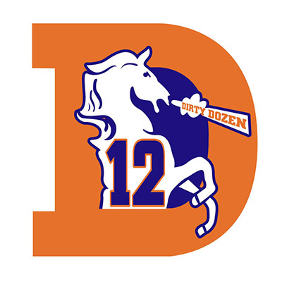
What we like: We love the way the Dirty Dozen incorporated the Broncos colors. Tying in your favorite team’s mascot or colors helps personalize your logo. The treatment of the D with the snorting bronco inside is an especially nice touch. A great logo sure to intimidate.
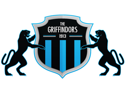
What we like: Similar to the Dirty Dozen logo, The Griffindors have done a nice job tying in the Carolina Panther colors and the mascot. The shield is a great choice for a Fantasy Football logo, symbolizing strength and fortitude – qualities every good Fantasy Football team should have on hand.
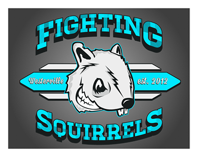
What we like: While we’re not sure about the history behind this team name, we love the overall design of the Fighting Squirrels logo. Great font choices paired with a strangely intimidating squirrel head make for a really solid Fantasy Football logo.
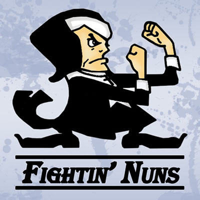
What we like: The Fightin’ Nuns logo is maybe a little less polished than some of the other logos on this list, but that doesn’t diminish our respect for a quality team name and logo. The utter fierceness of the nun caricature should be enough to send most teams running for the hills.
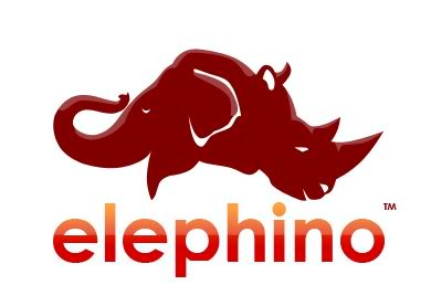
What we like: What’s not to like about this sweet logo? The clever mashing of the elephant and rhino heads is incredibly interesting and is a perfect tie-in with the Elephino team name. Now if someone could just tell us how to pronounce that name, we’ll be set.
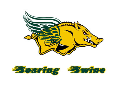
What we like: This pig looks like he is out for blood! He strikes just the right note of intensity to be a good Fantasy Football logo. We like the combo of yellow and green colors and the wing design on this soaring swine is a nice touch. The only criticism here is that the font is a little hard to read, but other than that – a solid effort.
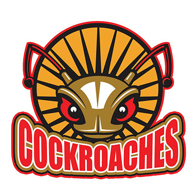
What we like: Everyone knows that you can’t kill a cockroach and unfortunately the same can be said for a lot of Fantasy Football teams. This logo is just solid all around. Great colors, great imagery and great font choice. It’s one that any fantasy football team owner would be proud to display.
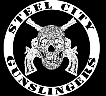
What we like: Oof – this is one tough logo. This Fantasy Football logo for the Steel City Gunslingers just makes you feel like your team is going to get battered and bruised, even if the matchups are pure fantasy. The detailed drawing of the guns and skull might seem overdone in other logo designs, but rendered in black and white, this logo is a winner.
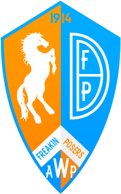
What we like: We can appreciate a team who really owns who they are and accepts the fact that they are just Fantasy Football posers in the end. While this logo has quite a lot going on, we like the use of the shield and the color choices.
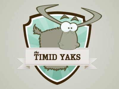
What we like: This is another team that really knows it’s place. It’s not out to intimidate anyone and that message is conveyed strongly through the cartoony design of the Yak to the subdued color choices. While most Fantasy Football logos tend to be on the bold and brazen side, it’s refreshing to see a clever logo with solid design.
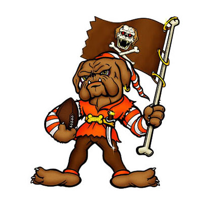
What we like: This bulldog is ready to play! With a nice nod to the Tampa Bay Buccaneers (which we assume is a favorite of this team owner), this swashbuckling bulldog strikes the right note of intensity and intimidation. A great caricature that showcases the personality of this team well.
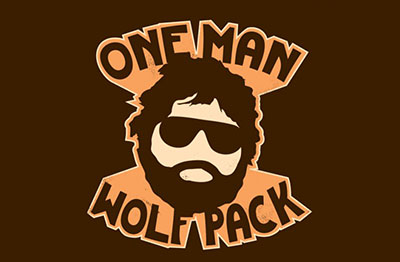
What we like: Really, the better question is what don’t we like about the One Man Wolf Pack logo. Pop culture references are very common in Fantasy Football, but it’s uncommon to see a logo designed as well as this one. Great colors, clean lines and cleverness abound in this one-man show of awesomeness.
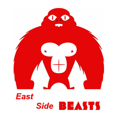
What we like: There are very few Fantasy Football logos that look so good that they only need one color. The East Side Beasts is one of those logos. This giant red gorilla looks intimidating and if we’re going to be frank, a little empty behind the eyes – he will crush your team…and your soul.
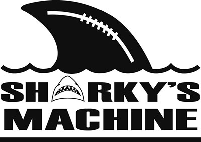
What we like: There’s no way around it – sharks rule. This Fantasy Football team owner has cleverly replaced the A in Sharky, with a shark image and that really helps this logo stand out. We also love the treatment of the shark fin at the top with the addition of the football laces. All in all, great integration of football elements with the team personality.
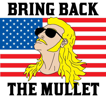
What we like: Bring back the mullet! We would love to know if there is a story behind this team name, but even if there isn’t, this classic Fantasy Football logo had us jumping up and screaming “Merica!” How can you not love that glorious blond mullet?
Create your Fantasy Football Team Logo Today With Logo Design Studio Pro Online.