The logo crew at Summitsoft has been back at it again and this time we’ve chosen to go after one of America’s all-time favorite things: best beer logos. Beer has a rich history and the right brew can inspire a passion from it’s drinkers that is virtually unmatched.
As an industry, beer has produced some of the most iconic and recognizable logos the world has ever seen and ranking these logos was not a task that the Logo Crew took on lightly. Since even the esteemed Logo Crew can have a hard time separating love for a particular beer from love of logo, we chose to establish a strict set of judging criteria to help remove any bias.
The Criteria:
- All logos will be judged on overall logo aesthetic appeal
- Historical context can be taken into consideration
- In the case that a consensus cannot be met, a vote will be taken where the majority rules
It is also worth noting that many fine beers were left off this ranking list. It was not our intention to offend or purposely leave out any delicious brews. For the purposes of this ranking, the Logo Crew looked specifically at the most popular and well-known beers in America and what resulted was a great cross-section of both quality and types of beer. So without further adieu, here’s our definitive ranking of the best beer logos.
- Natural Ice
There really isn’t much to like about the Natty Ice logo. It’s colors and shape give it an extremely dated feel and what are those blade things at the top? Are those meant to be ice skates? Whatever they are, they’ve just landed Natural Ice at the bottom of our Best Beer Logos list.
- Milwaukee’s Best Premium
The shape of the Milwaukee’s best logo isn’t altogether terrible, but this logo loses major points for font choice. Maybe it’s just us, but this particular font gives the logo a childish feel that doesn’t really fit with the premium name. Nice try, but a redesign would do wonders.
- Hoegaarden
In general, international beer logos tended to fare rather well in our ranking, but Hoegaarden is the one big exception. This logo does absolutely nothing to help define the product or it’s quality and maybe it’s just us, but the font and color choices are a little too similar to Auntie Anne’s pretzels to be taken really seriously.
- Sierra Nevada
On the whole, not an awful logo, but there is a lot going on in this Sierra Nevada logo. So much so that it placed very low in our rankings. While we appreciate that they are trying to pull in strong ties to their geographic location and have obviously taken the time to design something beautiful, it’s just far too much for a beer logo and we couldn’t place it higher.
- Keystone Light
Another logo that isn’t terrible on the surface. We like the off-center, upward slant of the logo, but on the whole, the Keystone logo is far too similar to another famous beer logo on this list to place higher.
- Budweiser Select
The Budweiser Select logo is one of the few that our team was not in full agreement on. In fact, we were pretty divided on whether or not the logo was terrible or pretty decent. On the plus side, it’s a completely different look than any other beer logo out there. On the negative side, the hand-drawn crown gives the logo an amateurish feel, which is not a great fit for a “premium” beer.
- Kirin Ichiban
The only Japanese beer on our list, Kirin Ichiban has a lot going on. We love the ties that they have made in pulling from Japanese tradition and culture – both very important for beer, on the other hand, it’s a very busy logo and while it looks great on a bottle, it probably does not translate well to other mediums.
- Miller Lite
This particular logo with the gradient shading was put into place in 2003 and while it held up well for quite awhile, the look has gone a little stale in the last decade. The good news is that it appears that Miller is making strides to go back to a more retro logo with the launch of retro cans in the summer of 2014. Good move Miller, good move.
- Rolling Rock
The Rolling Rock beer logo was another one that our team could not agree on. Roughly half the team loved the uniqueness and the history of the logo and the other half just plain didn’t like or understand it. Mass confusion put Rolling Rock at our number 29 spot.
- Coors Light
Coors Light was developed and launched in 1978 and the logo has remained very consistent since that time. While we like the backdrop of the Rocky Mountains, which helps emphasize the beer’s history, the logo overall falls a bit flat for us.
- Leinenkugel’s
One member of our team was unfamiliar with this Wisconsin brew and could barely read the name. That alone puts it toward the middle of our list since one of the key elements to any good logo is readability. Add on top of that a lot of intricate detail and you’ve got a beer logo that is just slightly overcooked.
- Red Hook
Bonus points to Red Hook for creating a logo that is simple, straightforward and easily translated between mediums. That being said, it’s an easily forgettable logo and one that is difficult to fall in love with as fans of other brands do, which is why Red Hook lands at our number 26 spot.
- Busch Light
The classic Busch Light logo has actually changed very little since it’s inception and since it has such a traditional, iconic design, that is A-Ok. While it’s definitely not one of the most memorable or original logos, it’s also not a terrible design.
- Bud Light
Bud Light is officially the most popular beer in America and the Bud Light logo showcases this with a design that caters to the masses. Neither terrible nor great, the Bud Light logo does it’s job and lands the logo in our number 24 spot.
- Bass
The Bass beer logo automatically gets bonus points for being the first trademark in the UK. That iconic red triangle has been in use for over 150 years and while we appreciate the history, our panel thought that the look was a bit flat, which put Bass at number 23.
- O’Doul’s
O’Doul’s has the distinction of being our only non-alcoholic brew included in this ranking, but it has earned it’s spot with some solid design. We like the traditional font with green lettering, which helps to play up the Irish ties. The overall layout of the O’Doul’s logo is also very attractive and while it’s not one of our very favorite’s the O’Doul’s logo gets a passing grade from our panel.
- Molson Canadian
The Molson Canadian logo really does do a great job playing up the ties to it’s home country. The red maple leaf gives this logo a nice pop of color and while we don’t love the alternating red and blue in the Canadian name, the overall design and feel of this logo gives it decent marks.
- Pabst Blue Ribbon
The PBR logo is one of those classic images that just works. Our panel loved the traditional design and the only thing that held us back from placing it higher was the fact that it is so similar to the Pillsbury logo.
- Michelob Ultra
The Michelob Ultra logo is rather elegant in it’s simplicity. The font choices are excellent and the red ribbon as well as the Anheiser Busch logo both help highlight the quality and value of the beer. This is a logo that looks great on a beer bottle, a t-shirt and just about everywhere else you want to put it. Well done Michelob.
- Old Style
There really isn’t much we dislike about the Old Style logo. Our panel loved that this logo played up ties to the medieval era and the juxtaposition of the classic, fancy font with a very accessible, inexpensive beer plays very nicely. Well played, Old Style.
- Moosehead
Who doesn’t love a great moose? The second of our Canadian beer logos scores higher primarily because depicting an animal in an attractive way is rather difficult to do in logo design and Moosehead really hits the nail on the head. And seriously, who doesn’t love a moose?
- Foster’s
Kudos to Foster’s for creating a simple, understated logo that just works. The colors play well with each other and the overall design is both unique and eye-catching enough to be one of the better logos in the beer industry. And while we know Foster’s isn’t really “Australian for beer”, this logo still makes us want to put another shrimp on the barbie.
- Miller Genuine Draft
We’re going to counterbalance the attractive simplicity of the Foster’s beer logo with the ornate elegance of the Miller Genuine Draft logo. This truly is a beautiful logo that hits all the right notes. The colors and font choices make the MGD logo seem like something for a much more expensive beer and overall, it’s a very nice logo.
- Dos Equis
Those two red X’s, so big and so bold just tend to push the rest of the logo design into the area of background noise and that is just fine. This is a logo that people are proud to be seen with and the strong, bold design lands the Dos Equis logo at number 14 on our list of best beer logos.
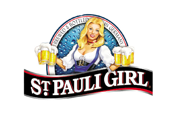
- St. Pauli Girl
Fun fact: The St. Pauli Girl logo is the only beer logo on this list to depict an actual person. And what a person it is! Is there any other logo that conjures up the feel of Oktoberfest and a great pilsner better the St. Pauli Girl logo? In general, we tend to steer people away from using cartoons or illustrated depictions in logos, but in this case, it just works.
- Beck’s
The Beck’s logo is just classically good looking all around. It’s got a solid font choice working for it, nice imagery and simple color choices. It’s a logo that just works and has the right appeal for it’s target market, sliding the Beck’s beer logo in at number 12 on our best beer logos list.
- Samuel Adams
Samuel Adams is largely credited with helping to usher in the craft beer movement in America and stylistically the logo is just spot on. Playing off the history of the company name with both the shape and the choice of font, the Samuel Adams logo is one that hits just the right notes with picky craft beer drinkers who just want to pick something up at the local grocery store.
- Miller High Life
Now this is a logo that just works no matter which way you slice it. Simple design and rather bold, retro color choices make the Miller High Life logo one that appeals not just to beer drinkers who want a cheap brew, but to anyone who wants to show off the fact that they are different and don’t need an expensive beer to tell the world that. Champagne of beers indeed!
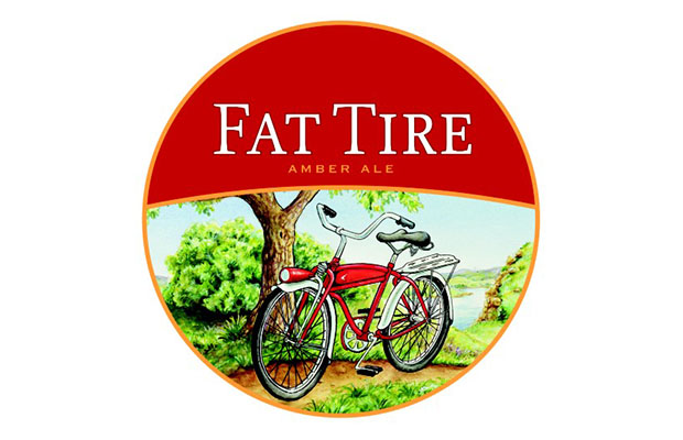
- Fat Tire
One of the most beautiful beer logos in the world, Fat Tire lands itself at number 9 on our best beer logos list through the sheer beauty of it’s design. The image of the bicycle resting against a tree is gorgeously rendered, giving the Fat Tire logo a real aspirational feel. It’s a beer that people not only want to drink, but that they want to show off as well.
- Red Stripe
Hoo-ray beer! Classic, understated and almost elegant, the Red Stripe logo is an illustration in why sometimes the obvious choice is also the best choice. Because Red Stripe tied the logo design so closely to the name of the beer, they’ve come up with something that is instantly recognizable and appealing at the same time. Hoo-ray Red Stripe!
- Blue Moon
The Blue Moon logo is one of the best examples of what a great craft beer logo with mass appeal can look like. Featuring a great color scheme, a slightly funky, but appealing font choice, the Blue Moon logos is one that is so appealing to almost everyone, which helps to explain why the beer has grown so quickly over the past two decades.
- Newcastle
The one and only Newcastle Brown Ale logo featuring that bright blue star is one that has whethered the test of time and is still one of the best looking beer logos out there. The oval shape and color scheme are both unique and even though this British beer is extremely popular in both the U.S. and the U.K.,it’s still perceived as a bit trendy and hip. All around, solid logo design puts Newcastle at our number 6 spot of the best beer logos.
- Corona
The font choice is everything for the Corona logo. The classic lettering gives the Corona logo a truly unique feel that is different from every other beer logo out there. It’s a logo that truly does make you want to go kick of your shoes and find a beach.
- Budweiser
There are very few things that are as quintessentially American as a Budweiser beer. The Budweiser logo is so thoroughly tied to American culture that in foreign countries, ordering an American beer will almost always get you a Bud. The classic red bowtie with the Budweiser name is as striking as it is memorable and that earns the Budweiser logo our number 4 spot.
- Stella Artois
Coming in at our number 3 spot is the ever-cool Stella Artois logo. The intricate design helps play up the fact that Stella is a high-end beer. Pair that with the stunningly unique gold-rimmed glasses and Stella Artois becomes not just a logo master, but a branding master as well.
- Heineken
Heineken has worked hard to become the definition of cool. It’s a hip beer with an even hipper logo. That simple red star paired with the open, accessible font makes the Heineken logo extremely attractive and appealing and for that, we’ve ranked it as our second-favorite beer logo.
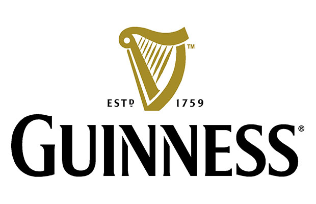
- Guinness
We’ve finally come to it, the best logo in all of beer. There should be little surprise that Guinness was chosen as the best beer logo overall. That classic gold harp with the bold, in your face font makes the Guinness logo both memorable and so cool at the same time. Virtually unchanged since 1862, the Guinness logo is one that we love and we’re sure will be around for hundreds of years to come.